UX Psychology: Why Users Don’t Read, They Scan
October 30, 2025
Let’s face it — most people don’t read online content word for word. They skim through pages, glance at headlines, and stop only when something grabs their attention.
This behavior frustrates many writers and designers, but it’s not carelessness — it’s how the human brain works.
Understanding why users scan instead of read is at the heart of UX psychology. It’s about seeing the web through the eyes of real people — busy, impatient, and looking for instant clarity. Once you understand that, you can design experiences that feel intuitive, simple, and human.
The Science Behind Scanning in UX Design Psychology
In UX design psychology, every design choice is rooted in how the brain processes information. Reading requires focus and effort, and effort increases cognitive load — the amount of mental energy needed to understand something.
When users are faced with long paragraphs, cluttered layouts, or competing visuals, their brains take shortcuts. Instead of reading carefully, they rely on cues — headlines, colors, icons, and buttons — to decide what matters most.
This behavior is explained through user experience psychology: people instinctively avoid unnecessary effort. They want to reach their goal as quickly as possible. Your design’s job is to make that path clear and easy to follow.
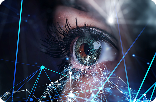
Eye Tracking and User Behavior Analytics
Through eye tracking and user behavior analytics, researchers have learned a lot about how people scan websites. Most users follow predictable patterns:
- The F-pattern, where eyes move across the top and down the left side of the screen.
- The Z-pattern, common in landing pages, where the gaze moves diagonally from top left to bottom right.
- The UX scan, where users jump quickly between bold words, headings, buttons, and visuals — skipping paragraphs entirely.
These patterns reveal that users are visual creatures. They don’t consume every detail; they look for signposts that tell them what’s important.
Visual Hierarchy: Guiding the Eye, Not Forcing It
Great design doesn’t shout — it guides.
That’s where visual hierarchy and design hierarchy come in. They’re the frameworks that help users know what’s most important at a glance.
Headings should stand out. Buttons should be clear. White space should allow the eyes to rest. Every element should have a purpose and a place.
When visual hierarchy is strong, users move through content naturally. When it’s weak, they feel lost and overwhelmed.
In user experience design, a well-structured hierarchy is what turns chaos into clarity. It’s one of the simplest yet most powerful tools for improving usability.
Reducing Cognitive Load Through Psychology
Every click, scroll, or visual element adds to cognitive load — and too much of it leads to fatigue and frustration.
The goal of thoughtful user experience UX design is to minimize that mental effort.
Here’s how designers can reduce it:
- Simplify choices: Limit the number of actions or links visible at once.
- Group related information: Help users process content faster through visual grouping.
- Maintain consistency: Familiar layouts lower the brain’s need to relearn patterns.
- Use contrast wisely: Highlight the most important actions or information clearly.
- Keep language clear: Short, direct copy is easier to scan and understand.
By applying these principles, designers respect the brain’s limits — turning complex experiences into effortless ones.
Minimalism, Focus, and Mindful Decisions
Minimalist layouts are a natural ally of UX psychology. When clutter is removed, the user’s attention can settle on what truly matters. A clean interface lowers cognitive load and supports mindful decision making, encouraging users to act with confidence instead of confusion.
This link between minimalism and productivity isn’t a design trend — it’s a psychological truth. Simplicity helps the brain focus, process faster, and make better choices.
The Power of UX Psychology in Digital Design
Good user experience design blends psychology, analytics, and creativity. It’s not just about how something looks — it’s about how it feels to use.
By combining user behavior analytics, eye tracking insights, and a strong design hierarchy, you can craft experiences that align perfectly with natural human behavior.
Understanding UX psychology helps designers go beyond visuals and build emotional connections. When a layout feels intuitive and effortless, users trust it. And that trust translates to longer sessions, higher conversions, and stronger brand relationships.
Final Thoughts
People don’t read online — and that’s okay.
They scan, they search, they move fast. Your job as a designer isn’t to change that behavior; it’s to design for it.
By applying UX design psychology, strengthening visual hierarchy, and using insights from user behavior analytics, you create experiences that meet people where they are.
In the end, great user experience UX design isn’t about controlling how users act — it’s about understanding why they act the way they do.
When you design with empathy, psychology, and simplicity, every glance counts — and every user feels right at home.