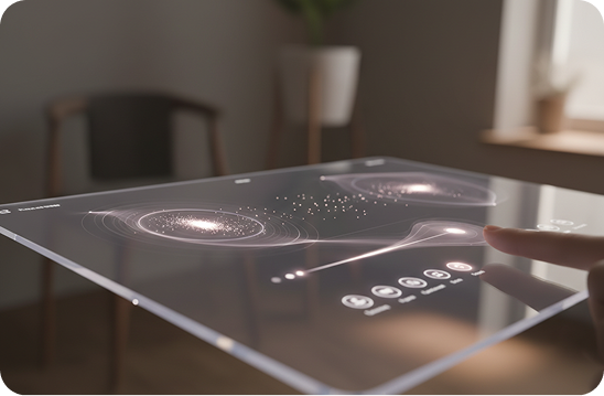
Micro-Interactions: The Small Details That Change Everything
Micro-interactions are one of those UX topics that sound small, but their impact is anything but. If you have ever felt that a website or app was smooth, intuitive, or simply enjoyable to use, there is a good chance micro-interactions played a role. In modern digital products, micro-interactions are often the difference between an experience that feels average and one that feels professional and trustworthy.
In this article, we will explore user experience micro-interactions, real UI micro-interactions examples, and how micro-interactions in web design can quietly improve usability, engagement, and brand perception.
What Are Micro-Interactions in User Experience?
User experience micro-interactions are small, focused moments that respond to a user action or system event. They are not full-featured. They are the tiny responses that help users understand what is happening and what to do next.
A micro-interaction usually includes:
- A trigger, such as a click, tap, or hover
- A rule that defines what should happen
- Feedback, like visual change, animation, or sound
- A loop or mode that controls repetition or state
These elements work together to provide clarity and reassurance. Without them, users are left guessing.
Why User Experience Micro-Interactions Matter
From a UX perspective, micro-interactions solve very real problems. They reduce confusion, prevent errors, and build confidence.
When micro-interactions are done well, they:
- Confirm that an action was successful
- Guide users without instructions
- Make interfaces feel responsive and alive
- Reduce frustration during loading or errors
In many cases, users do not notice them consciously. They only notice when they are missing.
UI Micro-Interactions Examples You See Every Day
UI micro-interactions examples are everywhere once you start paying attention. They are part of daily digital behavior.
Some common examples include:
- A button changing color when you hover or tap
- A subtle animation when a form field is completed correctly
- A loading spinner that reassures users that the system is working
- A heart animation when liking a post
- A toggle switch smoothly slides between on and off
Each of these moments lasts a second or less, but together they shape how users feel about the product.
Micro-Interactions in Web Design
Micro-interactions in web design play a critical role in making websites feel modern and usable. On the web, users expect instant feedback. If nothing happens after a click, trust drops immediately.
Well-designed micro-interactions help by:
- Improving navigation clarity through hover states
- Making loading feel faster with skeleton screens
- Preventing errors with inline validation
- Adding personality without distracting from content
In competitive markets, these details often separate high-quality websites from those that feel outdated or unfinished.
From Real Experience: What We’ve Seen in Real Projects
From real experience working on UX and web design projects, micro-interactions are often overlooked at first. Many clients focus on layouts, colors, and features, assuming the rest will fall into place.
What usually happens is this:
- The design looks good visually
- The functionality works
- But users describe the experience as confusing or boring
In several projects, we found that the issue was not the structure. It was the lack of feedback. Buttons felt dead. Forms gave no guidance. Loading states were missing.
Once simple micro-interactions were added, things changed quickly. Bounce rates dropped. Users completed forms more confidently. Clients started receiving fewer support questions. These were not major redesigns, just small interaction improvements.
One common mistake is adding too much animation. Another is adding none at all. The balance comes from understanding user intent and responding clearly, not decorating the interface.
Common Mistakes with Micro-Interactions
Despite their benefits, micro-interactions can cause problems if used incorrectly.
Some common mistakes include:
- Overusing animations that distract users
- Making interactions too slow
- Ignoring accessibility preferences like reduced motion
- Inconsistent behavior across screens
Micro-interactions should support usability, not compete with content.
Best Practices for Micro-Interactions in Web Design
To design effective micro-interactions, keep these principles in mind:
- Keep them fast and purposeful
- Make feedback clear and immediate
- Use motion sparingly and consistently
- Always consider accessibility and performance
The goal is not to impress users, but to help them feel confident and in control.
Why These Small Details Truly Change Everything
Micro-interactions may be small, but their impact on user experience is massive. They turn static interfaces into responsive systems. They help users feel understood rather than confused.
When users trust an interface, they stay longer, engage more, and convert more easily. That trust is built through hundreds of small moments, not one big feature.
Strong UX is rarely loud. It is quiet, smooth, and reliable. Micro-interactions are the details that make that possible.